Sun Electrical
Branding that works as hard as they do — practical, bold, and made to cut through the clutter of Calgary's service vans.
Project Scope
Brand Identity Exploration
Focus
Fleet & Vehicle Graphics
Role
Concept, Design, Art Direction
Why this concept matters
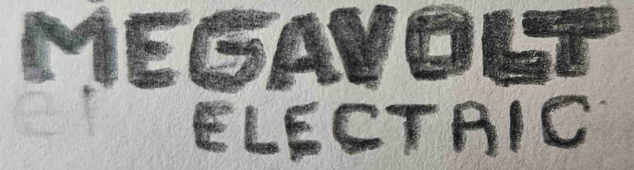
This self-initiated exploration grew out of time spent supporting Megavolt Electric. I watched how often trades vehicles were wrapped in graphics that were either cluttered, forgettable, or so templated that they blended into Calgary traffic. Sun Electrical — a solar-focused division of a well-branded parent company — offered the perfect fictional brief: build a companion identity that could stand proudly on its own while still feeling like a trusted extension.
I leaned into heraldic depictions of the sun: spirited faces with radiating rays that could read at speed yet feel personable up close. A stylised solar panel — square with clipped corners — became the counterpoint, signalling innovation and technical credibility. When combined, the emblem behaved like a bold badge that could scale from a van wrap to a stitched uniform crest without losing energy.
Project Snapshot
- Type: Self-directed brand identity concept
- Timeframe: 3 weeks of focused exploration
- Tools: Procreate, Illustrator, Adobe Dimensions, Affinity Designer
- Deliverables: Emblem system, sun icon set, wrap kit, stationery & apparel concepts
Strategic Priorities
Research Insight
Calgary's service vans create a noisy visual environment. The identity had to cut through fast-moving clutter while still feeling trustworthy and hardworking.
Design Objectives
Craft a bold emblem that could flex from signage to uniforms, develop a modular system that scales across digital and physical touchpoints, and keep production practical for trades teams.
Deliverables
Logo system, sun icon set, repeatable pattern library, vehicle wraps, stationery, and apparel concepts prepared for presentation to decision-makers.
Sketch Exploration
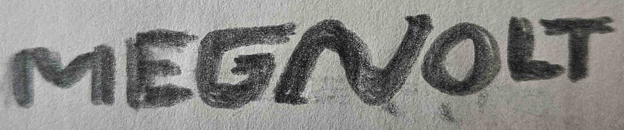
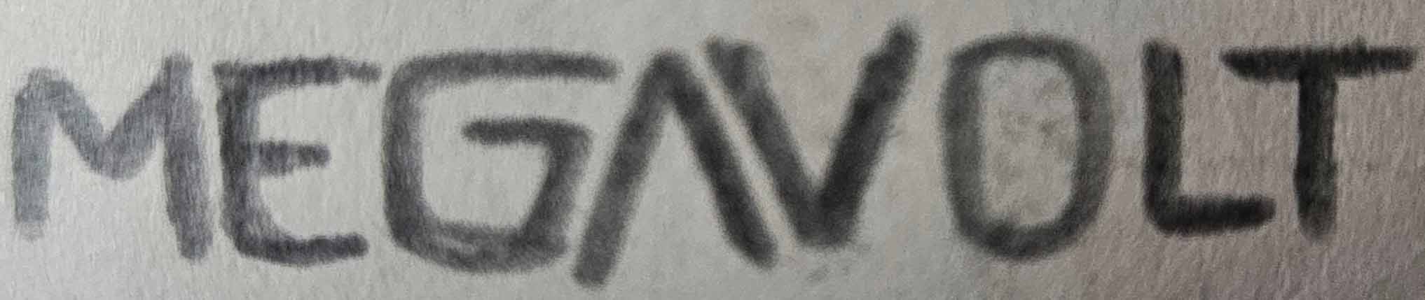
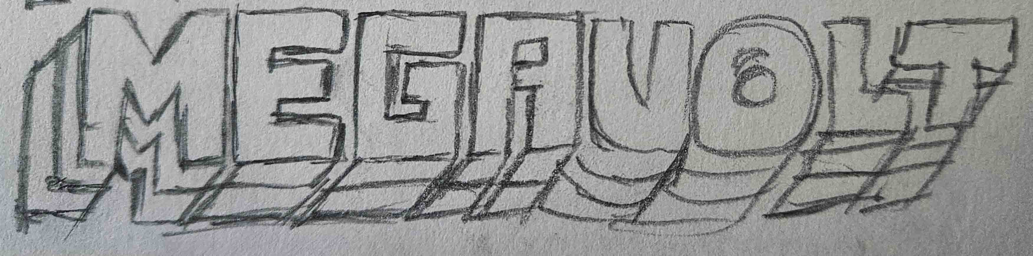
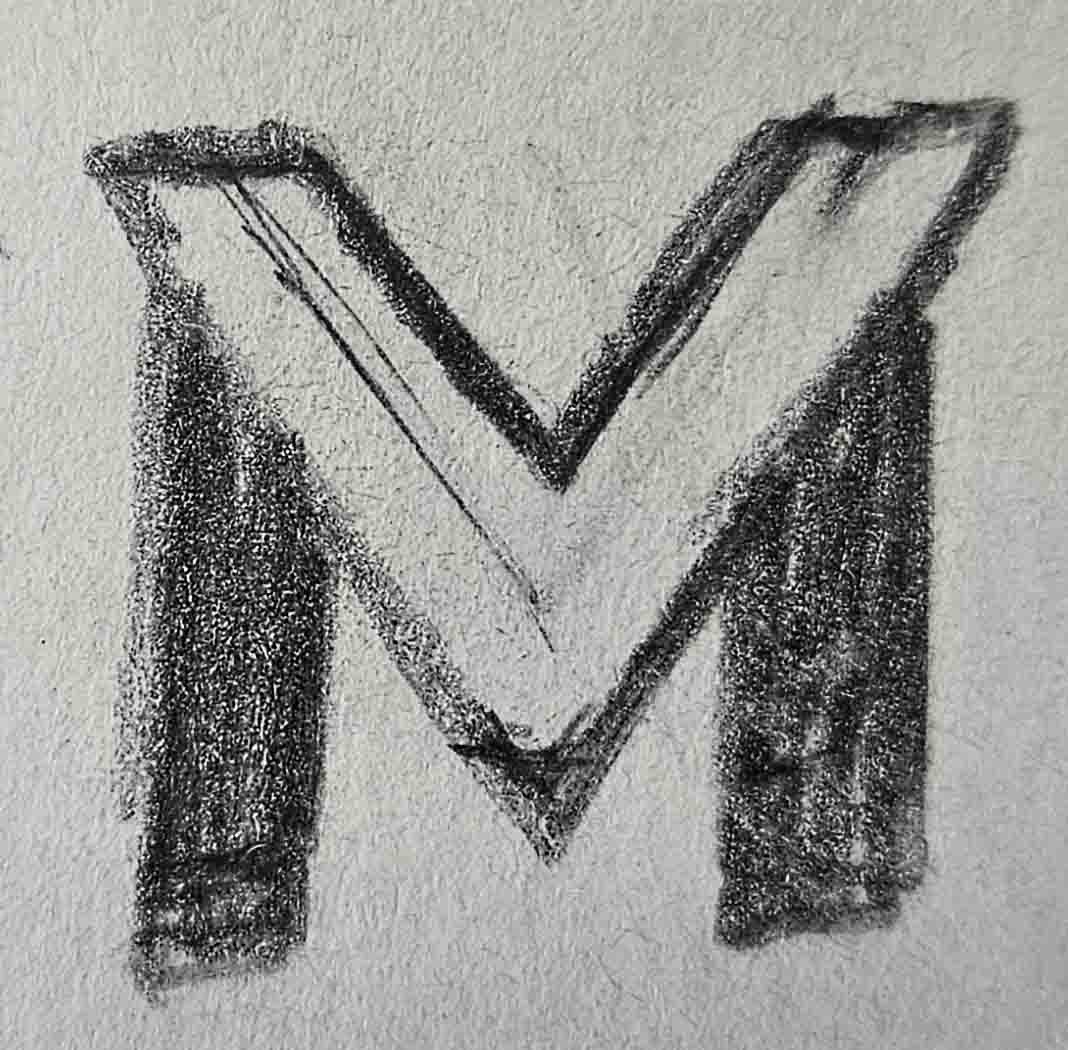
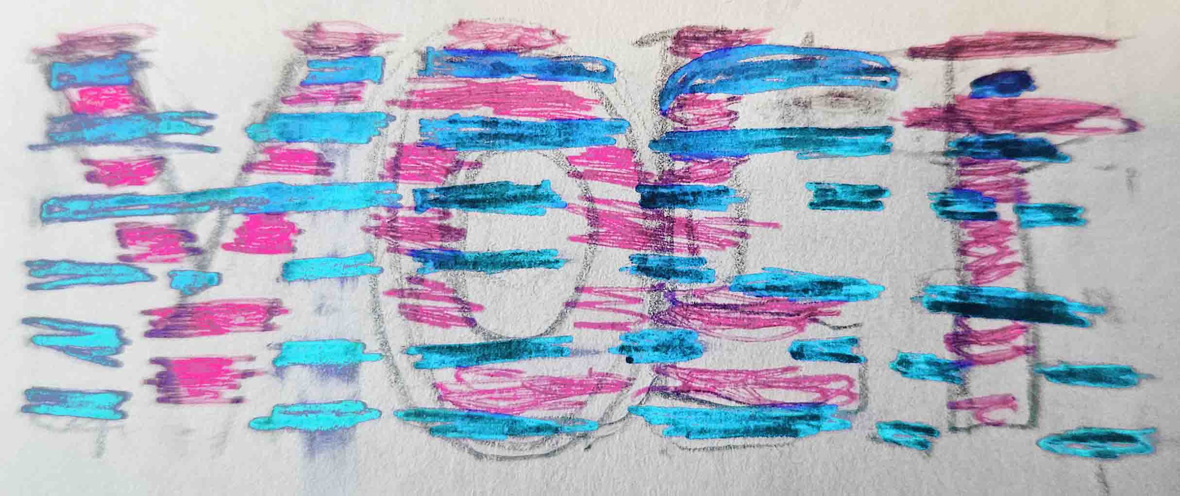
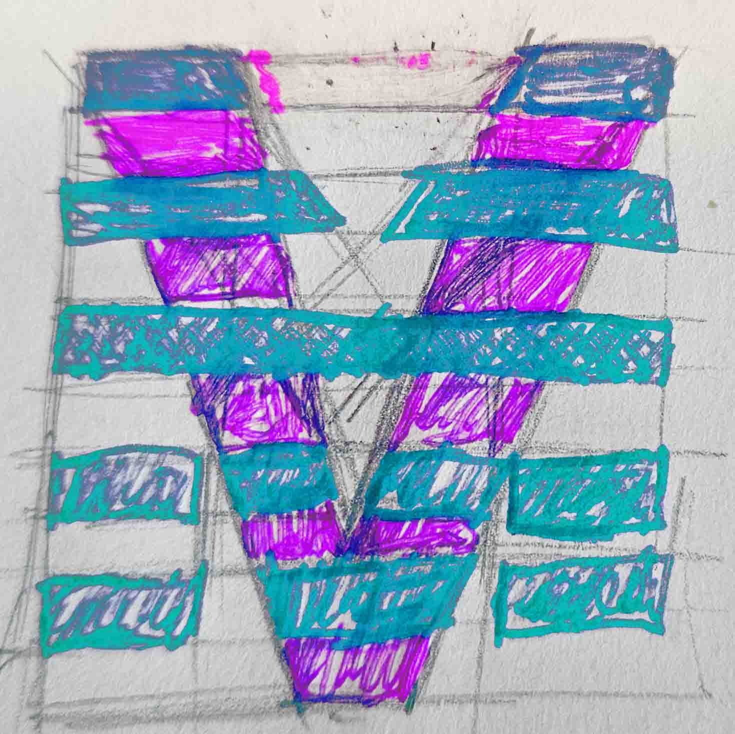
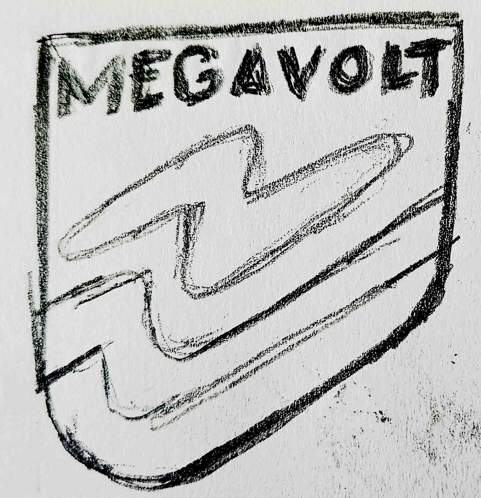
Volume wins clarityEarly ideation focused on sun faces, radiating rays, and panel-inspired geometry. Iterating on paper kept the emblem expressive but grounded in forms that would plot cleanly onto vinyl, embroidery, and digital canvases.

Building the system
Fleet graphics focused on impact: clean typography, restrained messaging, and a repeatable blue-and-ochre palette that knits together vans, stationery, and apparel. The sun motif provided enough expressive range to build patterns, icons, and vehicle graphics while the panel kept everything grounded and legible.
- Logo architecture
- Primary lockup, stacked mark, and emblem-only versions tuned for embroidery and cut vinyl.
- Color palette
- Sunlit ochre + deep technical blue create high contrast in daylight and on reflective vinyl.
- Typography
- Utilitarian sans-serif headlines with a friendly grotesk secondary for body copy and livery details.
- Pattern library
- Repeatable motif derived from the sun emblem for large-format wraps and interior panels.
Solar panel × sun emblem
Subtracting the corners of a solar panel created a distinctive container that makes the illustrated face feel engineered rather than ornamental.
Fleet-first deployment
Wrap templates demonstrate how the emblem scales, how patterns break across panels, and how to keep messaging legible at speed.
Collateral kit
Stationery, invoices, and uniform applications keep the sun motif present without overwhelming utility items.
What I learned
Sun Electrical is a reminder that expressive branding only works when it earns attention and communicates at a glance. The exercise sharpened my ability to balance personality with practical constraints — exactly the type of thinking I bring to client projects.
- Restraint can make expressive illustration feel more authoritative than playful.
- Fleet graphics benefit from bold shape language more than verbose copy.
- Creating systems for imaginary clients offers a low-risk way to test new production constraints.