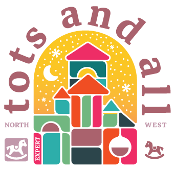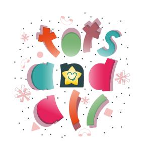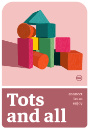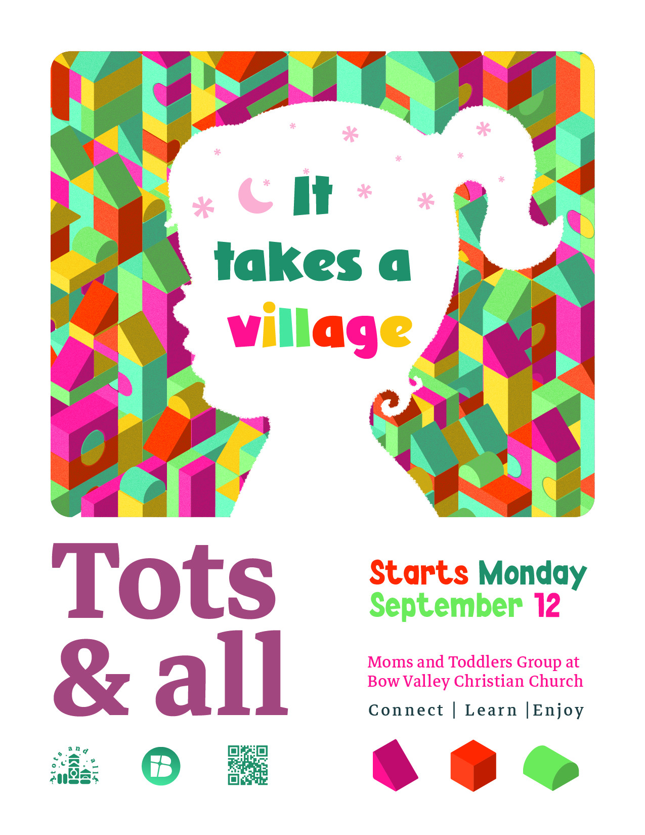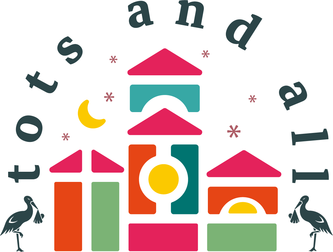
Originally part of a Calgary church, Tots & All wanted to become an independent community that welcomed parents from all backgrounds—especially non-members. They asked me to create a logo, but after a discovery session with their marketing lead, I proposed a fuller visual identity to support their outreach goals.
The group was primarily attended by mothers, but they were seeing more stay-at-home dads and wanted a brand that felt inclusive without being overly feminine. Inspired by wooden block toys—neutral, open-ended, and symbolic of growth—I built a system that balances warmth and clarity. A soft slab-serif font, playful geometry, and a muted, gender-neutral palette brought it to life.
I also suggested renaming the group from Moms & Tots to Tots & All to reflect their inclusive, educational focus. The team was thrilled—ordering branded shirts, mugs, and flyers. Months later, the identity is still actively in use, and I continue to attend as both a designer and member of the community.