Loooter
- Independent Project
- Lead Product Designer
- UX Strategy, Mobile App Design & Prototyping
An ad-supported digital lottery platform designed to replace predatory casino tropes with approachable gamification, transparent odds, and a low-cognitive-load mobile experience.
The Challenge
The initial MVP suffered from severe single-screen feature crowding, creating overwhelming cognitive load for players. The core UX challenge was restructuring complex interactions into intuitive, sequentially paced journeys that streamlined onboarding. Simultaneously, the design had to balance sustainable ad monetization against user fatigue, overcome payout skepticism through transparent winner validation, embed mandatory Canadian regulatory compliance and skill-testing questions, and rigorously align ambitious gamification concepts with the developer's backend technical constraints.
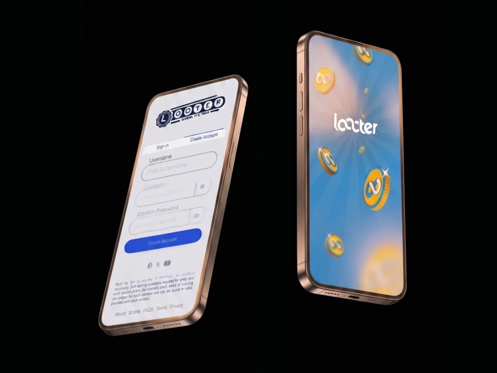
Consultation & Ideation
Initially approached for a logo design, an audit and unsolicited proof-of-concept demonstrating cognitive relief allowed me to realign the scope into a comprehensive UX overhaul. To build an ethical gamification model avoiding predatory casino mechanics, I analyzed competitive lottery apps and conducted field studies on physical slot machine visual hierarchies. Simultaneously, I instituted an asynchronous staging system in Figma, organizing dedicated development zones to streamline cross-functional alignment and rapid interaction testing.
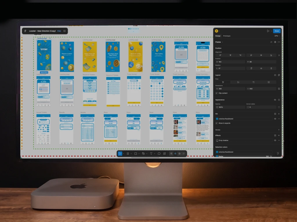
Wireframing & Prototyping
Using mid-fidelity greyscale wireframes in Figma, I structured the core user journeys to prioritize functional pacing and information architecture before visual polish. Complex multi-action views were split into progressive disclosure flows, turning ticket claims and prize tracking into sequential steps. I established an approachable, anti-casino visual identity, implemented slide-to-confirm friction patterns to prevent redemption and donation errors, and embedded live social proof feeds with transparent odds to proactively build user trust.
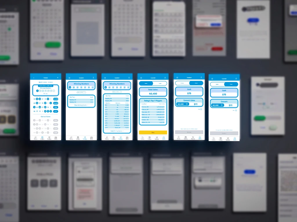
Final Result
The completed design delivers a clean, transparent, and approachable mobile sweepstakes platform that balances high engagement with responsible design standards. By dismantling the original single-screen clutter, the revised architecture drastically reduces cognitive overhead while preserving the full functionality of the backend mechanics.
The platform provides users with an intuitive, self-explanatory core loop, clear monetization feedback, and flexible redemption paths that support both direct gift card claims and charitable giving. The resulting design system establishes a scalable, production-ready foundation that aligns regulatory compliance with an engaging consumer product experience.